The Concept
Not “come and see our vineyards.”
A feeling.
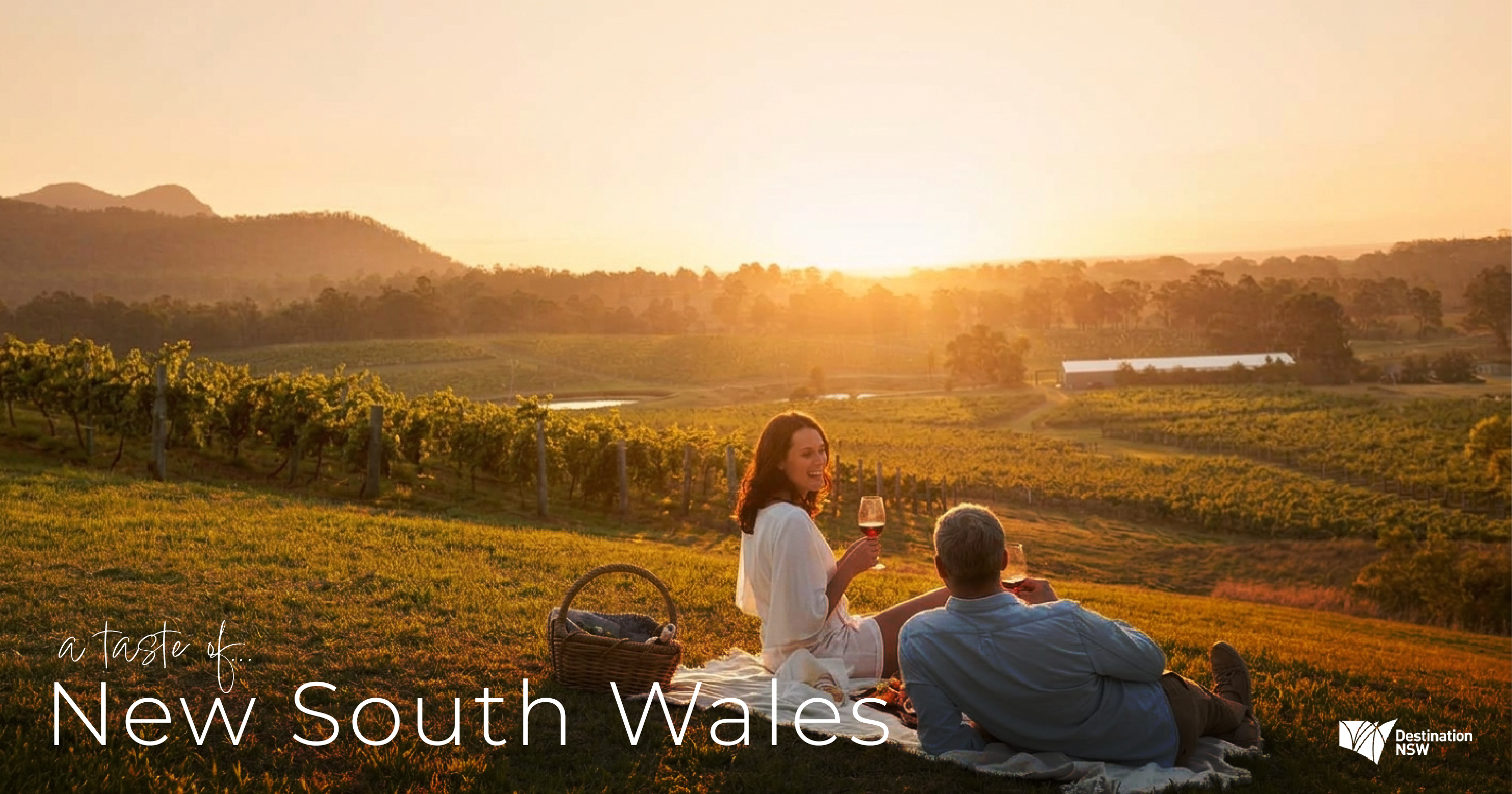
Golden hour in the vines. A long table, a glass poured, nobody checking the time. The creative built from a single emotional truth: the best part of a wine country trip isn’t the wine, it’s the ease. Sun low over the fields, good food, good company and not a care in the world.
Less Australia-as-adventure, more a slower,warmer light, closer to Tuscany than to the usual bright, busy tourism imagery.
The structure was simple: come for Sydney, stay for the sunset you didn’t know you were looking for. Open on the familiar harbour and sea, then pull the viewer in land into something they didn’t expect to find.
Creative Direction
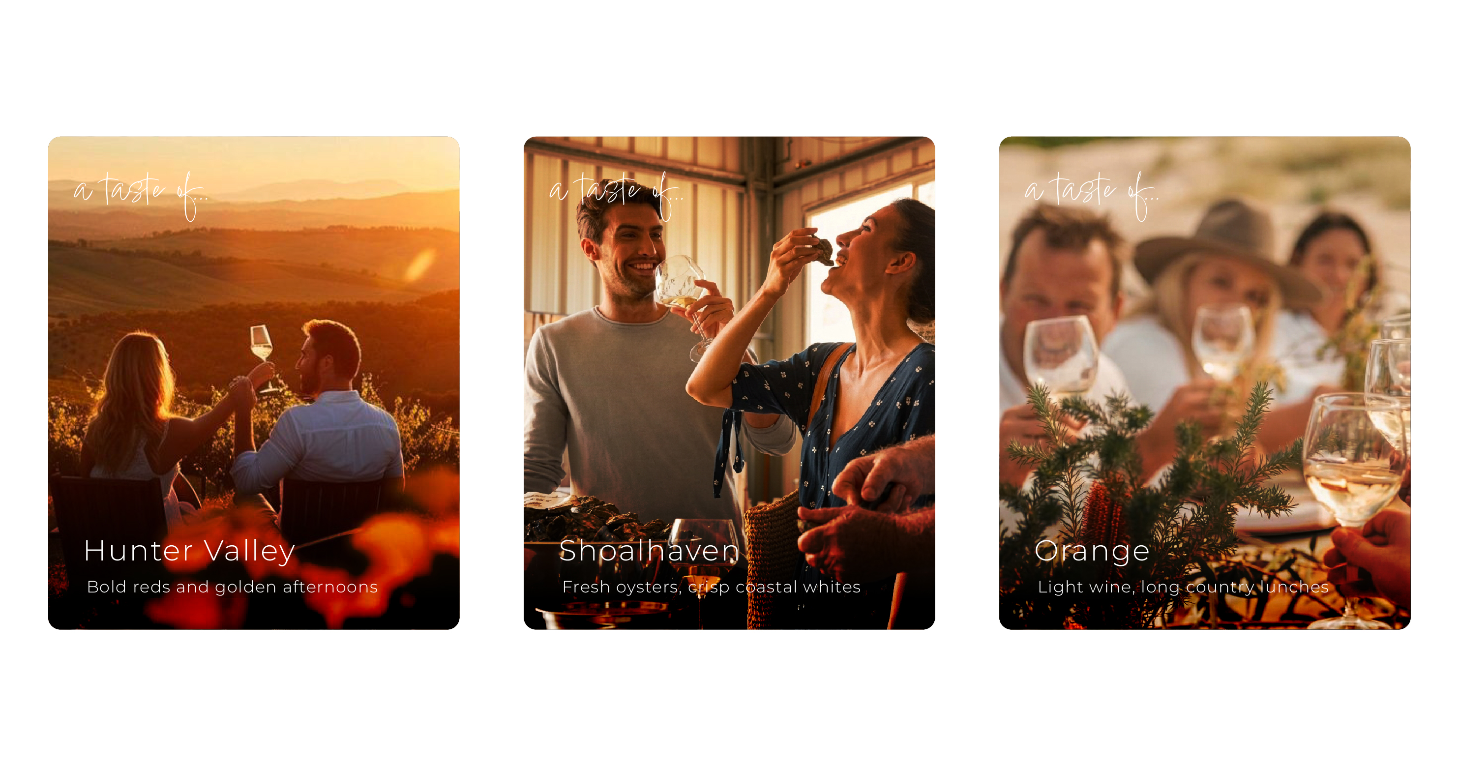
Photography-led. The image does the selling. Human, warm, experiential: people at tables, hands and glasses, long light across the fields, not empty landscapes or product shots of bottles.
A gold-and-green palette drawn from the fields at sunset, giving the campaign a consistent, premium warmth across every region and every format.
Thin, elegant typography, restrained, letting the photography breathe. The type is a quiet frame, never the feature.
One brand, sixteen regions. The system had to hold the Hunter Valley, Orange, Mudgee, the Shoalhaven, the Southern Highlands and the Canberra District as one coherent campaign while letting each region keep its own character.